PANTONE 2022 Autumn/Winter Colours

Image Credit - Pantone
As we inch closer to the Autumn equinox (September 21), are you curious to know which will be the Autumn/Winter colour trends for 2022/2023? In this week’s blog - we outline three of our favourite PANTONE shades chosen by colour experts based on seasonal trend forecasts for 2022/2023.
Coming together in a palette rife with conventional contradictions - the colours for Autumn/Winter 2022 reflect our need for harmony and tranquillity. This season's colours are a creative and intriguing mix of timeless tones and artful brights that allow us the opportunity to express our individuality without restraint.
In the aftermath of the pandemic, it's no secret that we have become braver with our decorating choices. The eclectic shades move away from the traditional – to invite playfulness and optimism into our homes.
Merging our respect for the environment and craving for serenity and wellbeing with light-infused pastels - and breaking the boundaries with energising brights that celebrate the now.
As we look to the future, we see two emerging paths that, while entirely diverse, are inevitably inter-connected. Here we explore how three key shades can be adopted into your homes this season.
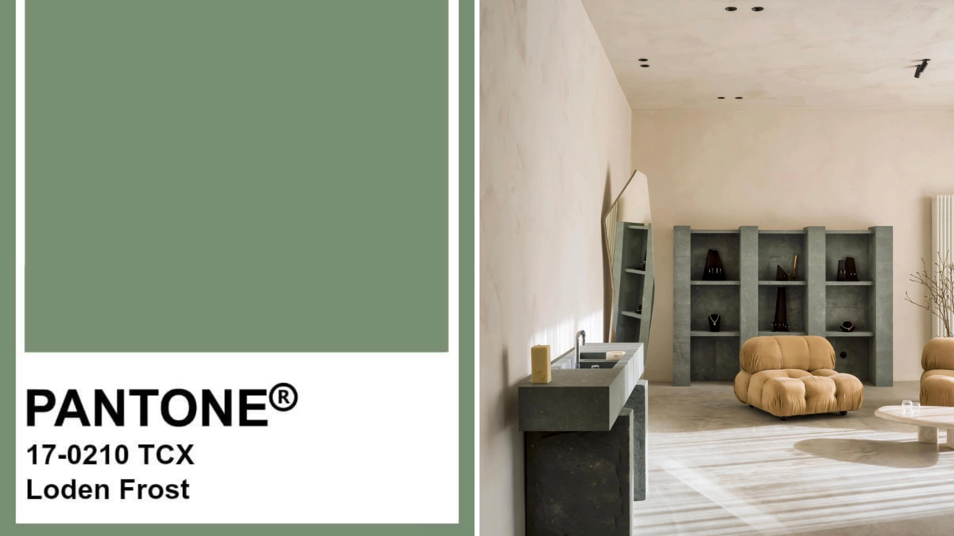
Image Credit (left to right) - Pantone, Ignant
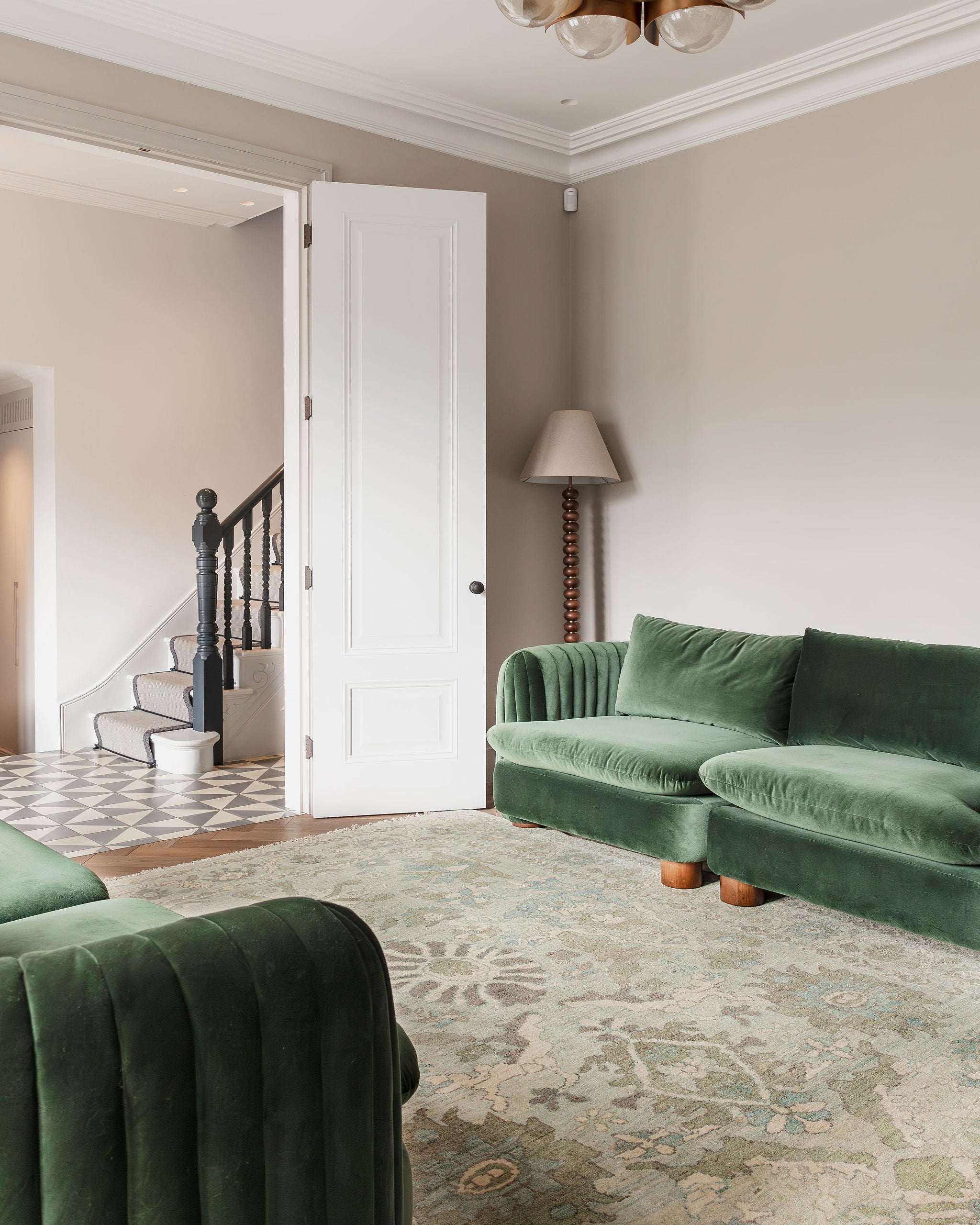
Bring calm, nourishing energy to any space with Loden Frost green. Loden Frost is a silver-toned, earth-infused, green tone that calms and restores. An elegant soft green paint is a pleasing natural colour for anywhere in the home, particularly in bathrooms and bedrooms.
Loden Frost Green is a mid-tone, neutral green with a viney undertone. It is varied as it is versatile. Incorporate this nature-inspired colour into your decor scheme for a refreshing style - introducing dark wood accents balances the beauty of this soulful colour.

Image Credit (left to right) - Pantone, MLKK Studio
Trends in furniture styles that confirm modern and minimal style will dictate the design fashions of the next few years - we find neutral colours among the favourites. A colour you will undoubtedly see used by Interior designers to create a refined and elegant look is - creamy autumn blonde.
It is a muted pastel orange hue that gently nurtures, serving up a serene palette that evokes the warm tones of a canyon sunset. Choose the creamy peachiness of Autumn Blonde - this earthy shade summons good energy for use in spaces where caring for ourselves and others is top of mind.
The neutral hue pairs beautifully with trendy design elements, such as rounded silhouettes, stone-slab tables, and sculptural armchairs. If you haven’t considered Autumn Blonde yet, now is your time.

Image Credit (left to right) - Pantone, Architectural Digest
If recent trends indicate the power of pink: we suggest you put your paint plans on pause until you consider using Strawberry Cream in your home. Strawberry Cream is a light-infused sweet pink, a silent yet stately presence when added to a room.
Pink paint colours are more desired than ever, thanks to it's versatility and breadth of tone. Unapologetic shades like fuchsia pink command attention, whereas more demure muted pinks deliver a warmer alternative to neutral colour schemes. There's a shade of pink to suit all styles and tastes.
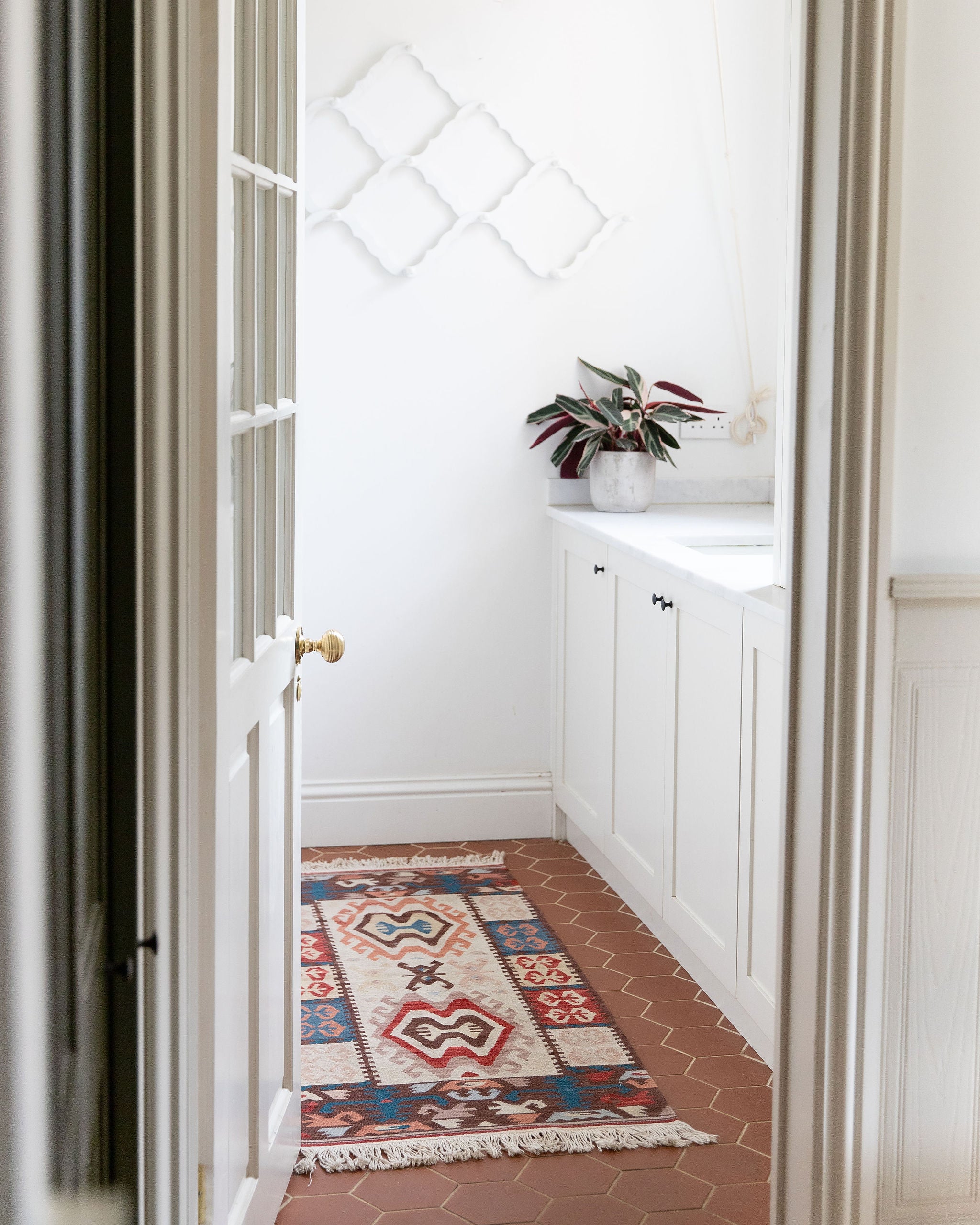
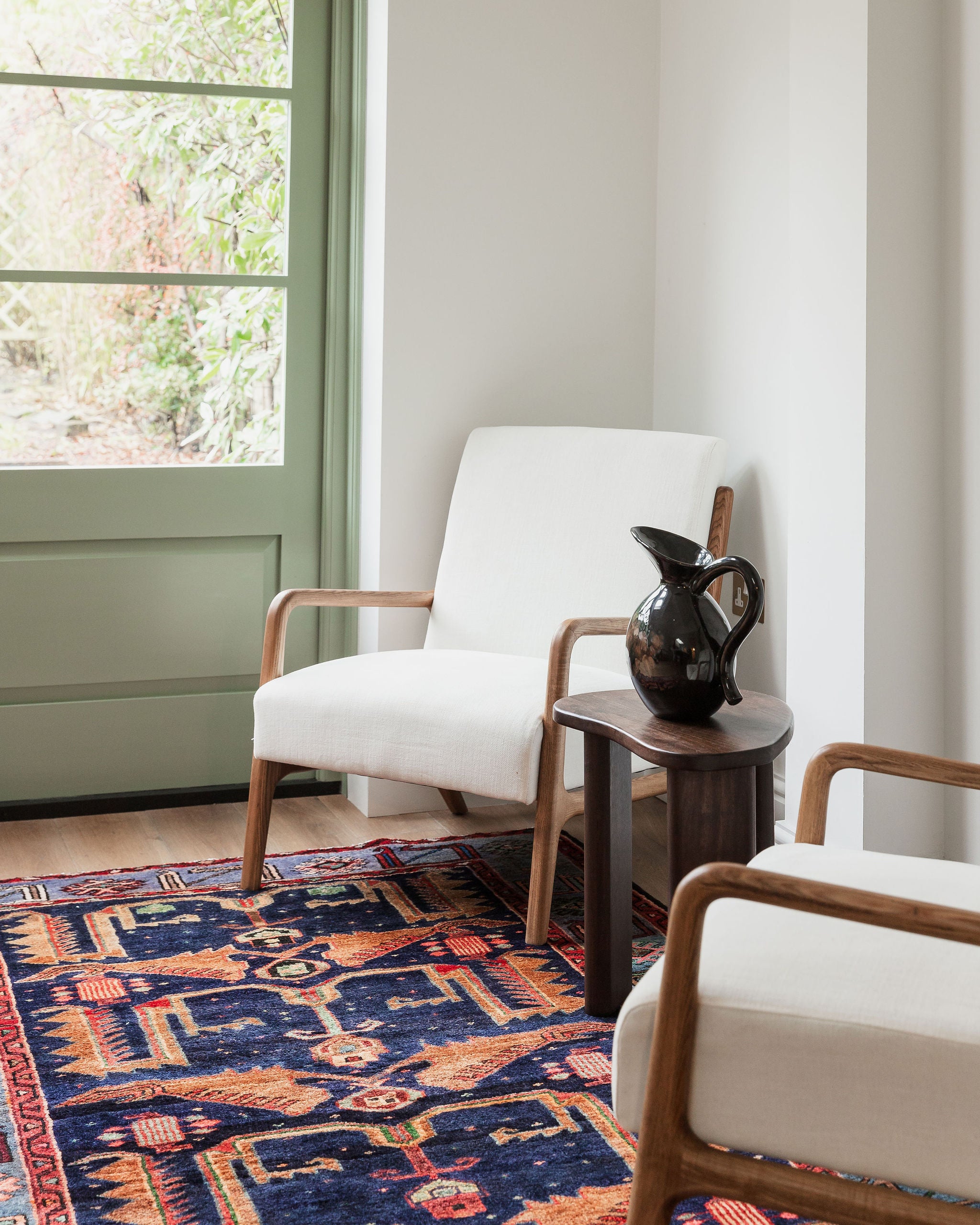
We have hand selected three Persian and Oriental rugs that perfectly fit with this seasons trending Pantone colours. Let us know which rug is your favourite.

