2022 Pantone Colour of the Year: Very Peri

Image Credit - Pantone
The Pantone Colour Institute highlights the top seasonal runway colours, selects the Pantone Colour of the Year, and forecasts global colour trends. This process has been running since 2000 and requires deep contemplation on colour psychology and trend analysis.
To reach the selection each year, experts at the Pantone Colour Institute scour the world for new influences: new technologies, art, upcoming media, movies, socio-economic and political conditions, travel destinations, fashion, and lifestyle choices.
For the first time on record, Pantone decided to create a new shade that wasn't already in its existing catalogue of colours. The company blended blue tones with violet-red, reviving gratitude for some of the qualities that blue conveys complemented by a new attitude that resonates today.
Very Peri, described by colour company Pantone as "a periwinkle shade of blue," has been named colour of the year for 2022 and places the future ahead in a new light.
Image Credit - Pantone

This year we need to feel encouraged and uplifted - this is essential to the human spirit. But as many continue to battle the Omicron variant and the world enters yet another phase of uncertainty, can Very Peri save us?
The periwinkle shade is used in the high-contrast games prevalent among Generation Z; it's also the colour associated with wellness. With roots in the natural world, with lilac, lavender, and periwinkle plants offering a calming sense during moments of chaos and uncertainty.
The colour marries the "constancy" of traditional blue with the "energy and excitement" of red. With trends in gaming, the expanding popularity of the metaverse, and the rising artistic community in the digital space: Very Peri illustrates the fusion of modern life and how colour trends in the digital world manifest in the physical world and vice versa.
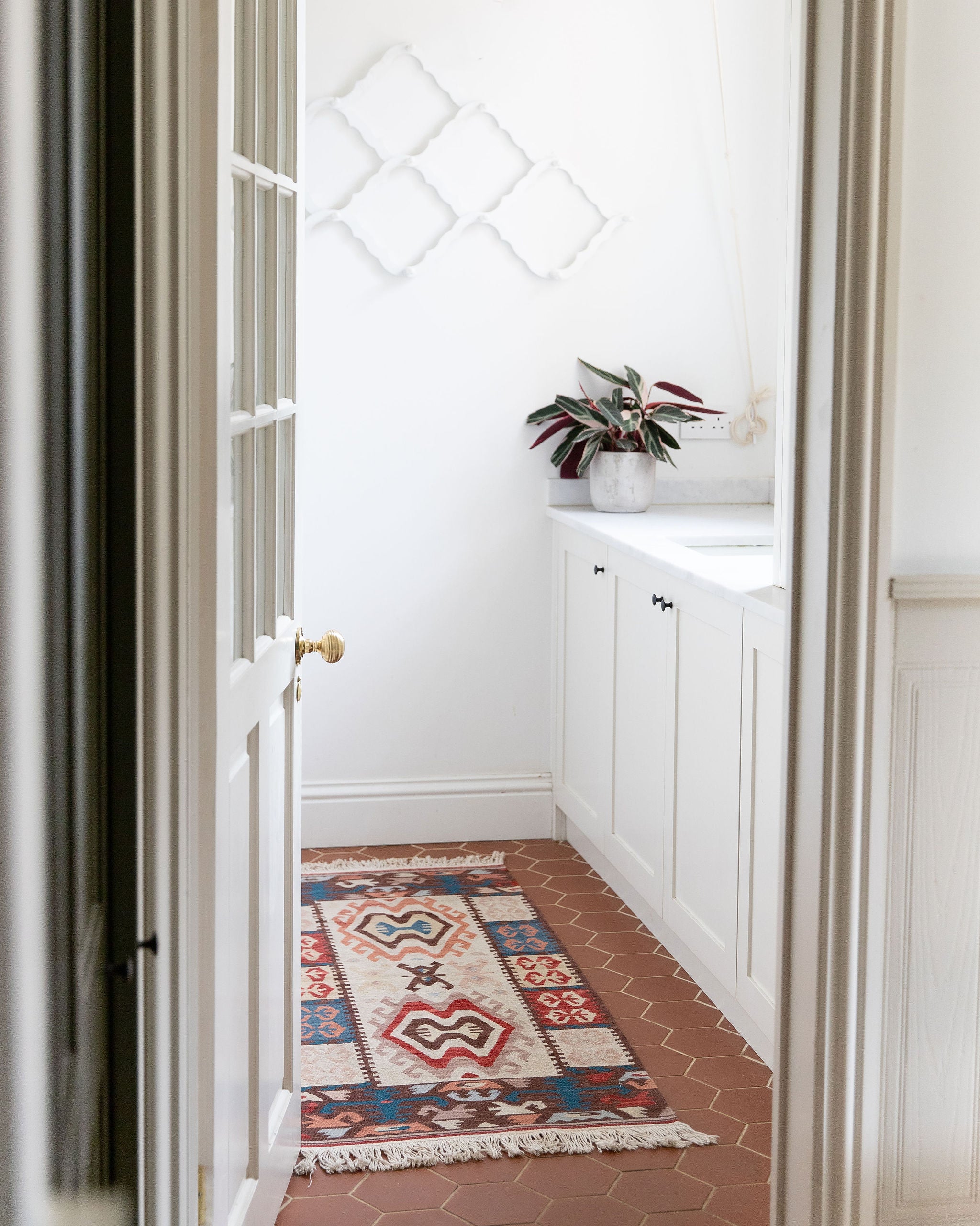
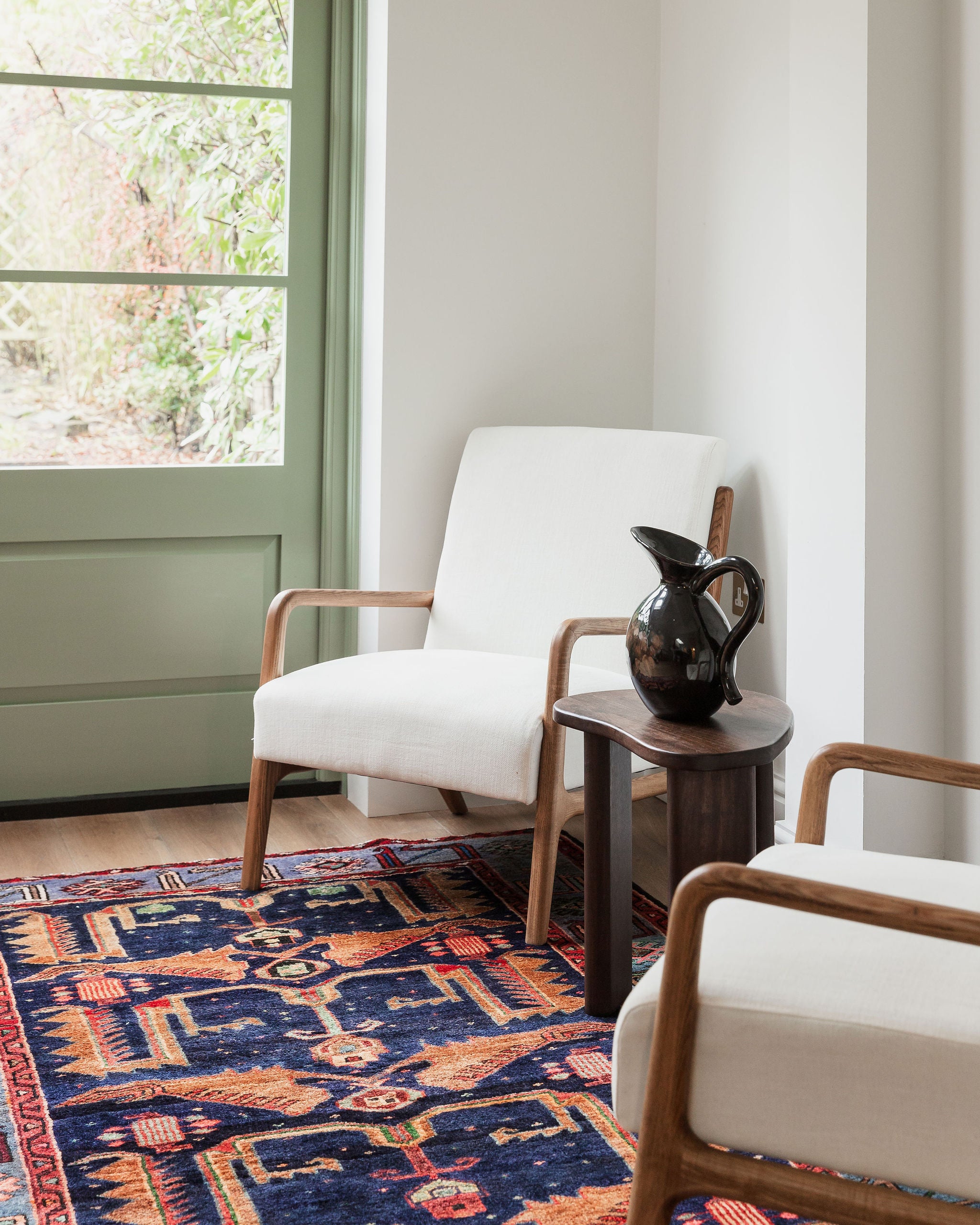
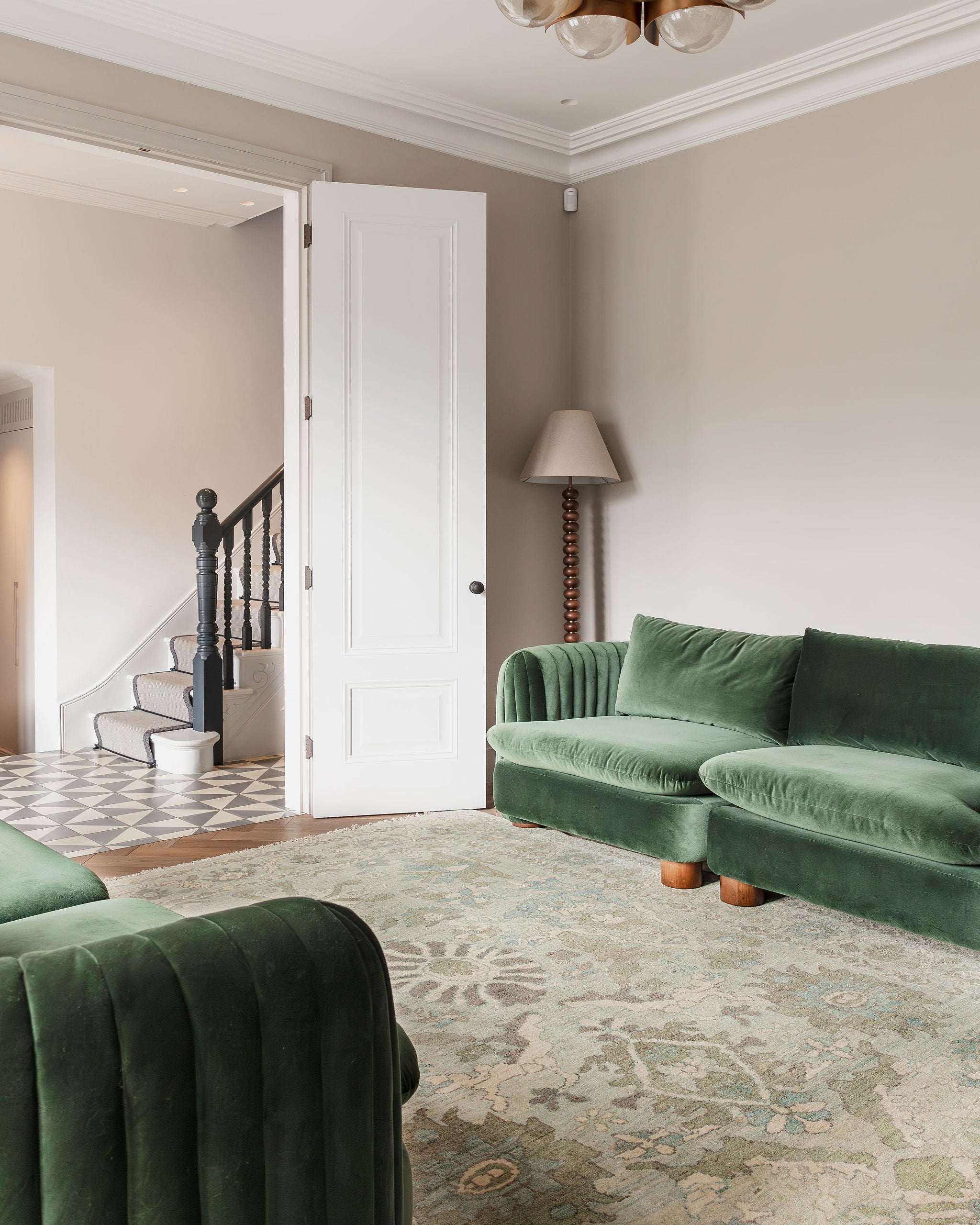
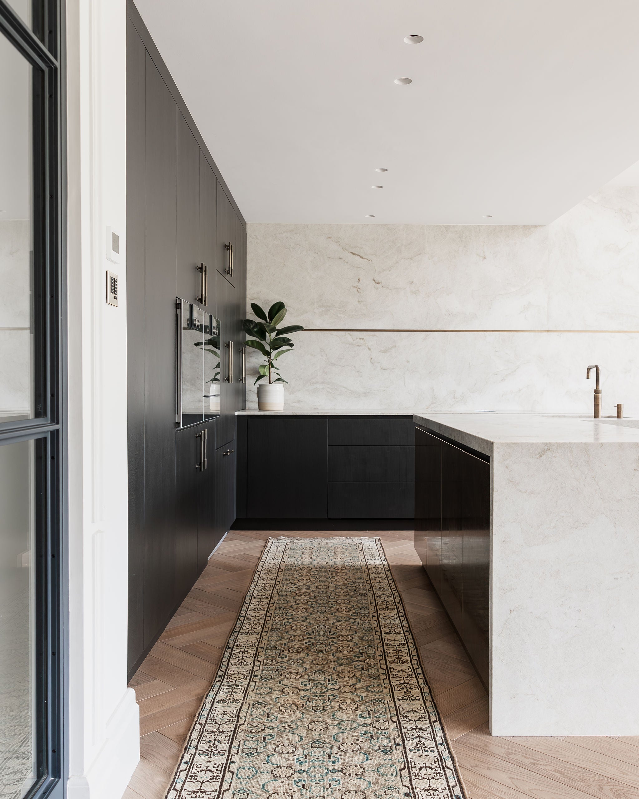
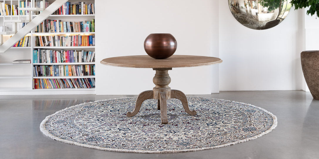
Here at Lilla Rugs we specialise in high-quality Persian and Oriental Rugs, all are beautifully detailed and come in an array of different styles, colours, shapes and sizes. We have curated a mood board of Very Peri colour inspiration for you, including our featured Very Peri rug IGGY.