Colour Psychology
How Can You Create The Perfect Mood Inside Your Home?
Colours are used to represent different emotions and moods. They are widely known to affect the human psyche as well as how we perceive spaces, objects and the way we think.
Most of our reactions to colour are personal, however, there are some ‘typical’ responses to colour which might be worth noting before you start planning to redecorate.
Darker colours will make a room feel smaller and more intimate, whereas lighter colours will make a room feel airy and roomy.
Whether you’re looking to add occasional bursts of colour or to decorate your entire room, discover the emotional effects of the rainbow in some of our round-up colour groups.

Image Credit - LuxDeco
WARM COLOURS
Warmer colours like reds, oranges and yellows are daring and dramatic whilst stimulating energy, creativity and appetite; hence being a popular choice for kitchens and dining areas where you engage in most of the entertaining. They are the perfect colours to make a room feel radiant and cosy.
Albeit, painting a room top to bottom in one of these colours could become over-stimulating, too intense, and perhaps evoke feelings of anger. We suggest using bold and bright touches of these variants around your room; a striking feature wall, stylish textiles or eye-catching accessories speckled throughout.

Image credit - Amara and Cut Y Paste
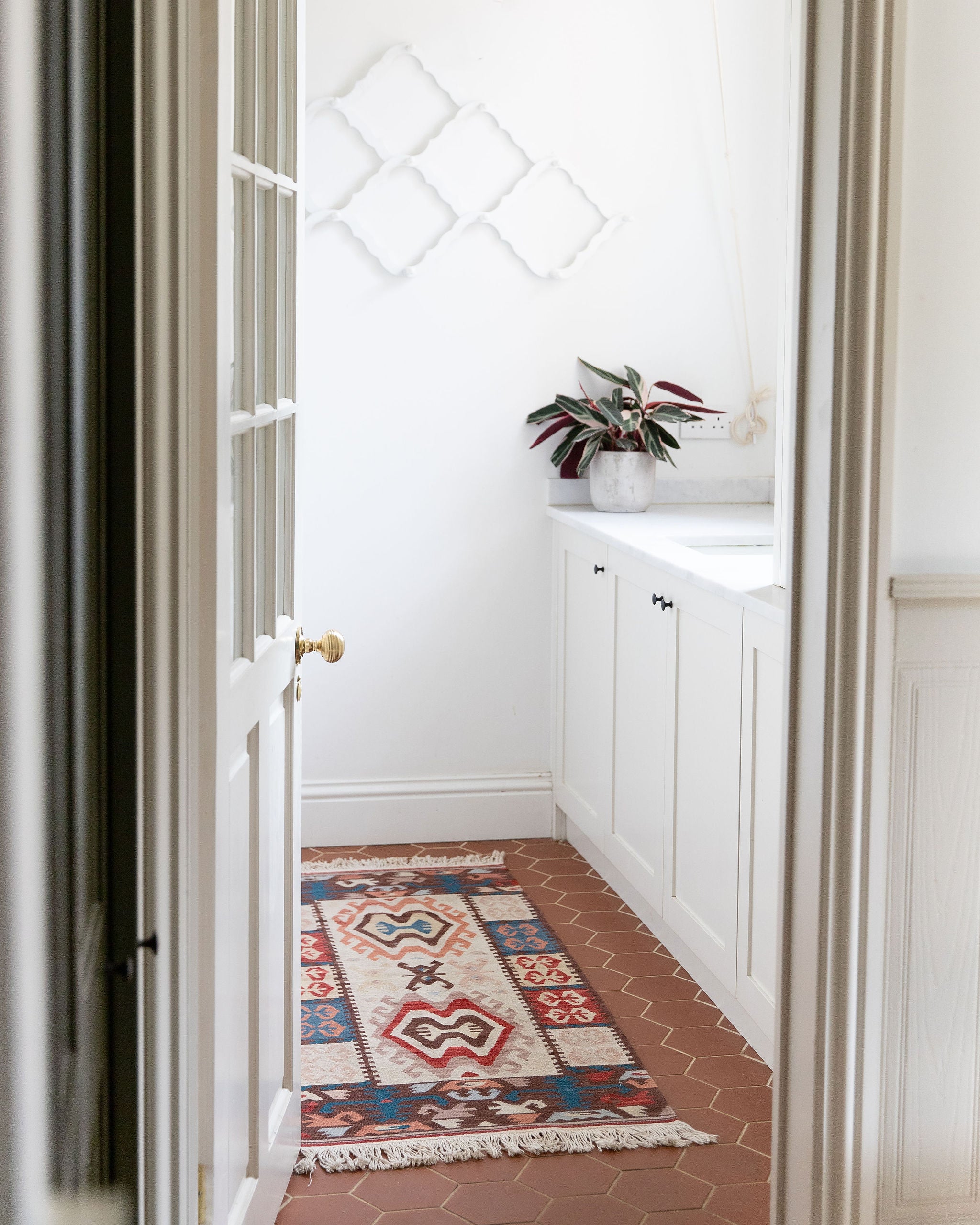
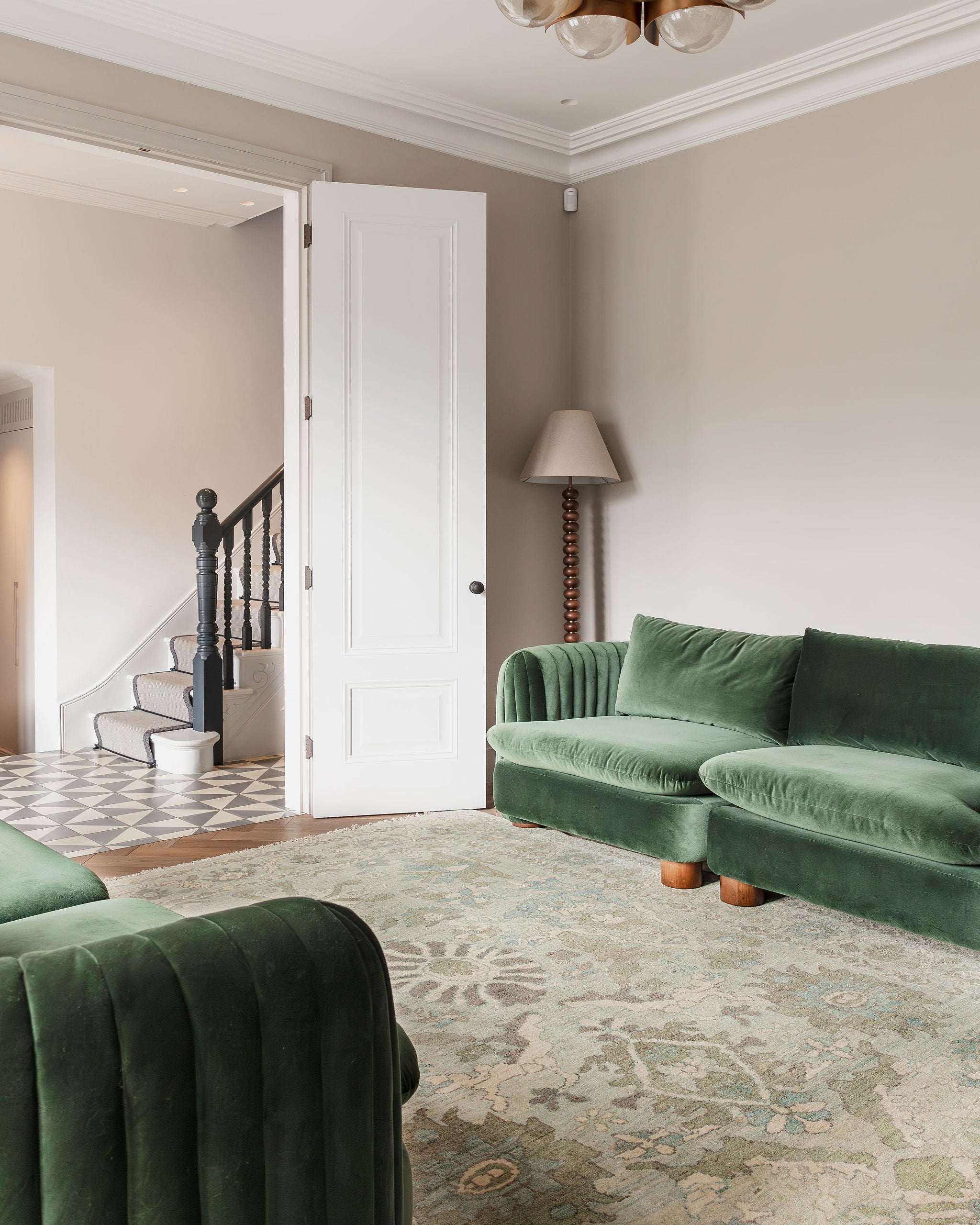
COOL COLOURS
Cool colours like blues, greens, and purples create the illusion of space and can have a calming and relaxing effect, making them the ideal choice for bedrooms, workrooms and particularly bathrooms (as it’s reminiscent of the sea).
Pairing cooler colours up with deeper accents like warm hardwood flooring works beautifully well, and if you want your home to be more connected to the outside world, try and mimic the natural make-up of the great outdoors by adding large indoor plants.
Richer variants, on the other hand, can be overpowering as a primary colour in a room and can induce inaction and sadness. Using these colours for accent pieces like a wonderful emerald green area rug, or a navy blue throw over your bed are an enchanting combination.

Image Credit - Topps Tiles and Camille Styles
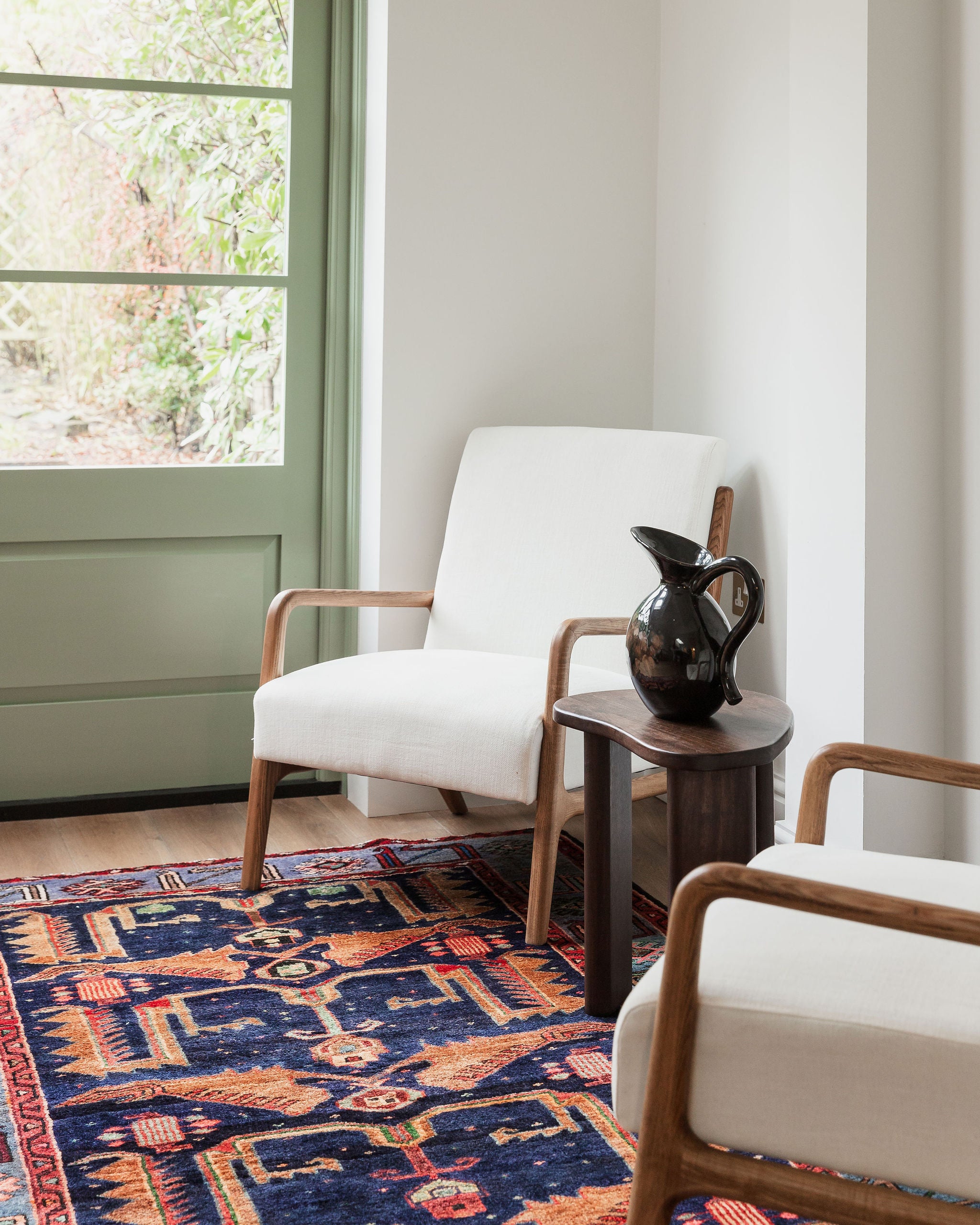
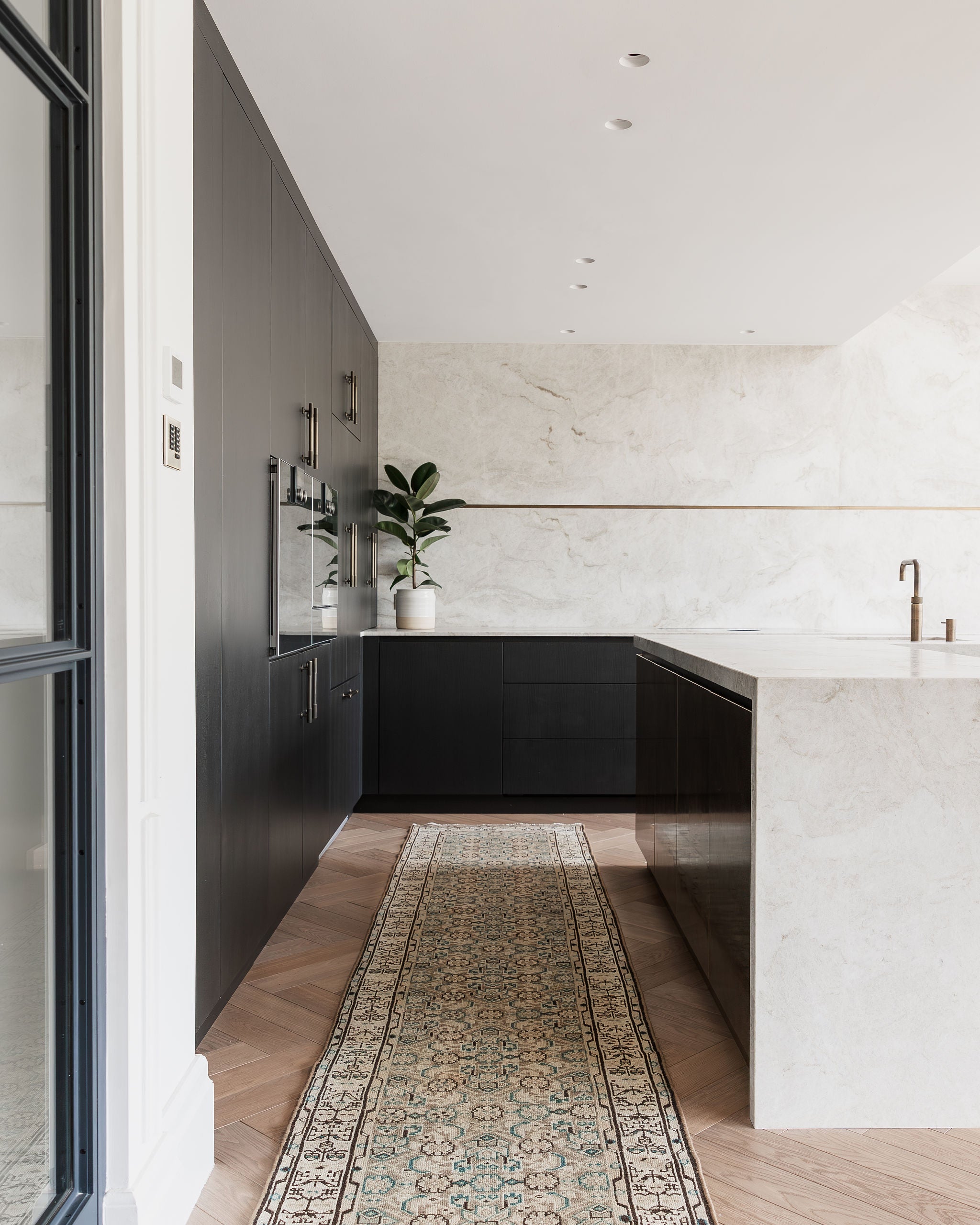
NEUTRAL COLOURS
White, Black, Grey
Don’t be afraid to use neutrals, they will never go out of fashion!
In fact, neutral colours tend to simply fade into the background and do not have a strong psychological impact on a person. This is why they are essentials in a designer’s toolkit, not only can they be used to accent any other colour chosen as a primary, but they make stunning primary choices of their own as well.
Muted tones like whites and creams are symbols of clarity and purity. When used as a primary colour in an area, they take a backseat which will allow you to add your own flair into the room completed with stylish wall hangings and works or art. These are ideal colours used in areas which have many different purposes or where simplicity is needed.
Black and Grey, on the other hand, will have somewhat different psychological effects, they can have certain negative connotations. However, if these colours are utilised wisely, they are superb for creating a bold, theatrical and sophisticated effect inside your home.

Image Credit - Snaidero and Hutchinson House
Whether we realise it or not, colours affect us and we respond to them. Before re-decorating consider how you want the room to make you feel. Colour can have a powerful impact on our psychology, and your rug can add to that too.