Trend Alert: 2019 Autumn/Winter Pantone Colours
It’s time to take a look at what will be in the spotlight of the design world for Autumn/Winter 2019/2020. In this blog post, we dive deep into a colourful new season, bringing us new trends for your home decor or interior design project. Expressing our wide-ranging acceptance of colour, combinations for Autumn/Winter 2019/2020 display a thirst for confidence; sophisticated and striking, a desire to realise your own individualised unique identities.
In this ever-Instagrammable age where every waking moment is a potential photo-op, this year’s Pantone Colour Institute’s colour palette is primed for individuality. Confidence-building shades like fiery Chilli Red and the deeper Biking Red, followed by complexion-flattering Crème de Peche. According to Pantone, the top colours for 2019 are all about expressing individuality. So check out here the Pantone colour trends that you won’t be able to resist!
CHILLI PEPPER
A spicy red, Chilli Pepper adds drama and excitement as it stimulates the senses

Image Credit (left to right) - Pinterest, Pantone, Pinterest
Fall’s leading colour is a spicier shade of red; It’s an opportunity to go bold, for new beginnings, to inspire you to take chances and perhaps find your new favourite colour. Chilli Pepper enables you to bring colour, power and excitement to your Fall/Winter home decor. This bright, fiery red exploded, showing the wilder side of the Autumn/Winter colour trends. On its own, it is a timelessly striking colour, while as an accent it pairs well with neutrals and warm tones. Whether in a statement upholstery piece, wall or centre piece rug, you can never go wrong with this colour.
BIKING RED

Image Credit (left to right) - Lushome, Pantone, Pinterest
If you’re daring enough, this is the berry colour that you need to add to your living room, bedroom and even office space. There’s nothing you can’t do with Biking Red. While Chilli Pepper has a warmth that casts a sense of drama and excitement that is very stimulating, Biking Red is somewhat deeper and not quite as hot. This deep red-brown tone leans a touch towards Merlot, acting as a pleasing alternative to it. Biking Red combines perfectly with wooden elements this Fall, calling out to that powerful yet cosy and comfortable vibe in your home decor.
GALAXY BLUE

Image Credit (left to right) - Fancy, Pantone, Pinterest
Thoughtful, evocative and representative of the greater galaxy or perhaps the deep ocean, this luxurious colour is transporting. It is the epitome of cold winter nights, the elegance that it offers is undeniable: Galaxy Blue is mysterious and powerful; A royal shade that one can easily get lost in. It is the perfect primary colour for Autumn/Winter 2019/2020, we love it most when it has the chance to stand out front and centre. Create a statement wall in your living room, or feel it on a velvet armchair or sofa. What more could be said about it? It speaks for itself!
CRÈME DE PECHE

Image Credit (left to right) - Australian Traveller, Pantone, Pinterest
We all require a little softness, shine, and relaxation in our homes; that’s precisely what Crème de Pêche brings you, a heaven-like hue that will shine amongst any other. This light peach colour might seem like it’s perfect for the summer, but Autumn/Winter isn’t all about dark tones. Embracing, but light, this soft colour is another warm one. The barest hint of peach means it’s a touch too feminine to be neutral. Though it does mean that it works well with the more delicate peaches we’ve seen a lot of this season, giving a creamy feel to any look.
SUGAR ALMOND

Image Credit (left to right) - Pinterest, Pantone, Pinterest
Pantone describes it as appetising, and we must agree! This sweet brown leans just a touch towards red, which makes it an instant fit with the red-heavy Autumn/Winter colour trends. Like Rocky Road, this brown is an earthy, grounding colour that provides a sense of stability. Sugar Almond is special because of its vibrancy; it pairs favourably with animal prints, and it’s as loud and attractive as a shade of brown can be. Bring a little peek of Sugar Almond into your home and watch the magic happen.
DARK CHEDDAR
Bold and daring, Dark Cheddar is a sharp blend of yellow and orange

Image Credit (left to right) - Lushome, Pantone, Pinterest
This distinctive colour extends the yellow palette of this seasons colour trends. A delicious mix of mustard and orange, Dark Cheddar is fitting for any season and Pantone is determined to convince us. It’s hard to imagine any other tone of yellow and orange working so well for these upcoming seasons, but Dark Cheddar presents itself as a beauty amidst brighter or darker colours alike. It’s a dark yellow tinged with quintessentially autumnal orange; in fact, it’s just a smidge darker than Butterscotch!
FRUIT DOVE
An extroverted pink, Fruit Dove creates a presence that can’t be ignored

Image Credit (left to right) - Houzz, Pantone, Pinterest
Bright and vivacious, Fruit Dove is a pink that can’t go unnoticed. This fun, fresh tone seems like an extension from the warmer seasons into the Autumn/Winter colour trends. Its impressive pinks have stayed on even in autumn, but then again Millennial Pinks have had a lot of attention recently as well as being a consumer favourite. It’s a colour that brings a smile to your face, and it’s definitely the kick you might need to get up in the morning and be productive, even when it’s too cold to get out of bed. If it’s raining or snowing outside, Fruit Dove will be keeping the hope and brightness alive indoors.
EDEN
Eden is a stately forest green that plays on tradition

Image Credit (left to Right) - Pinterest, Pantone, Pinterest
Last, but not least, Eden, a forest green that calls for the animalistic and tropical side in our home decor. This colour, described as ‘meditative’ by Pantone, is a true dark green, and it feels especially fresh despite its darkness. It’s unquestionably one of the shades you should go for this season if you want to stay on trend. Elegant and incredibly stunning, it’s a traditional striking green that can never go wrong in your home decor. This enchanting, stately forest green is winning over naturalists and office dwellers alike.
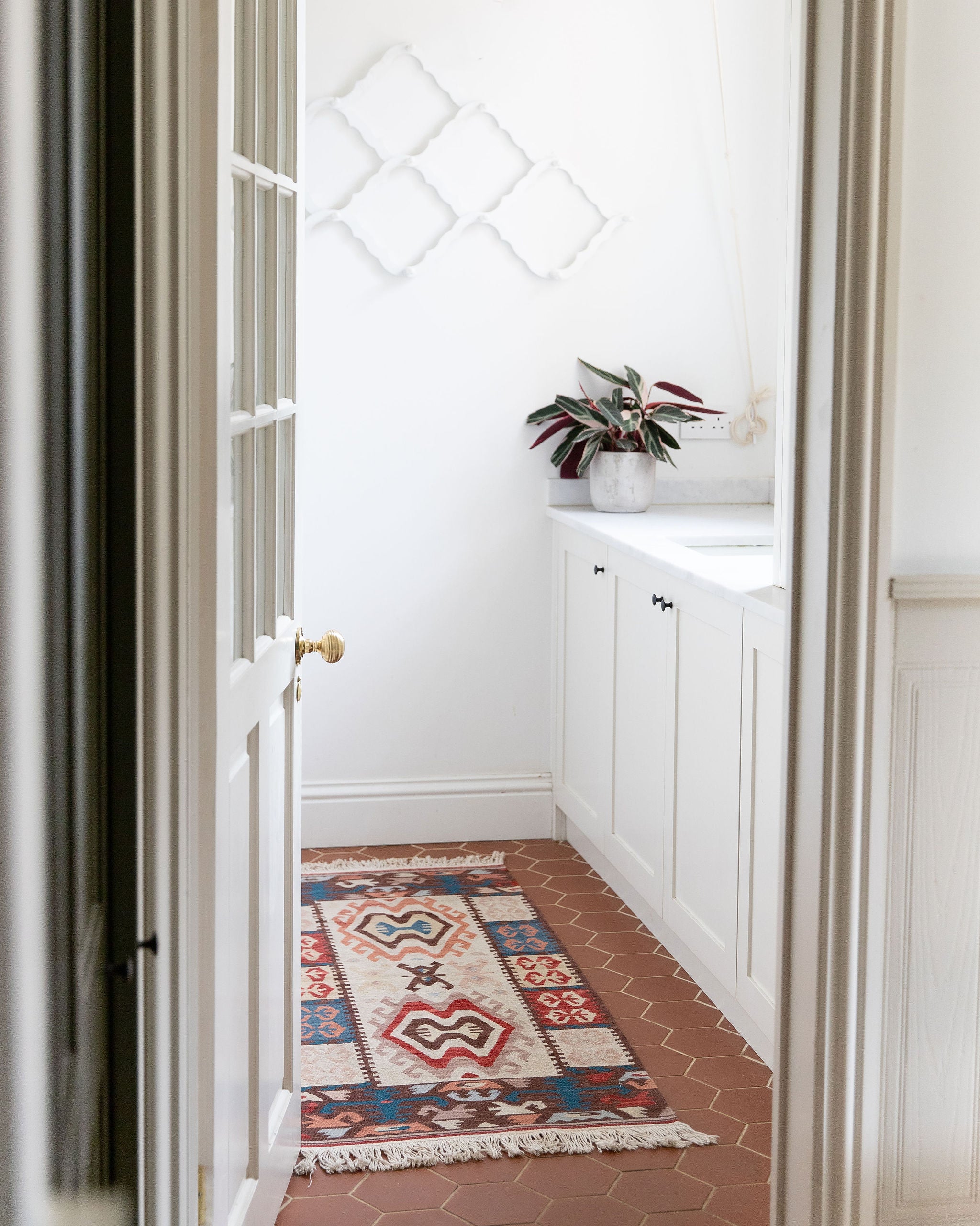
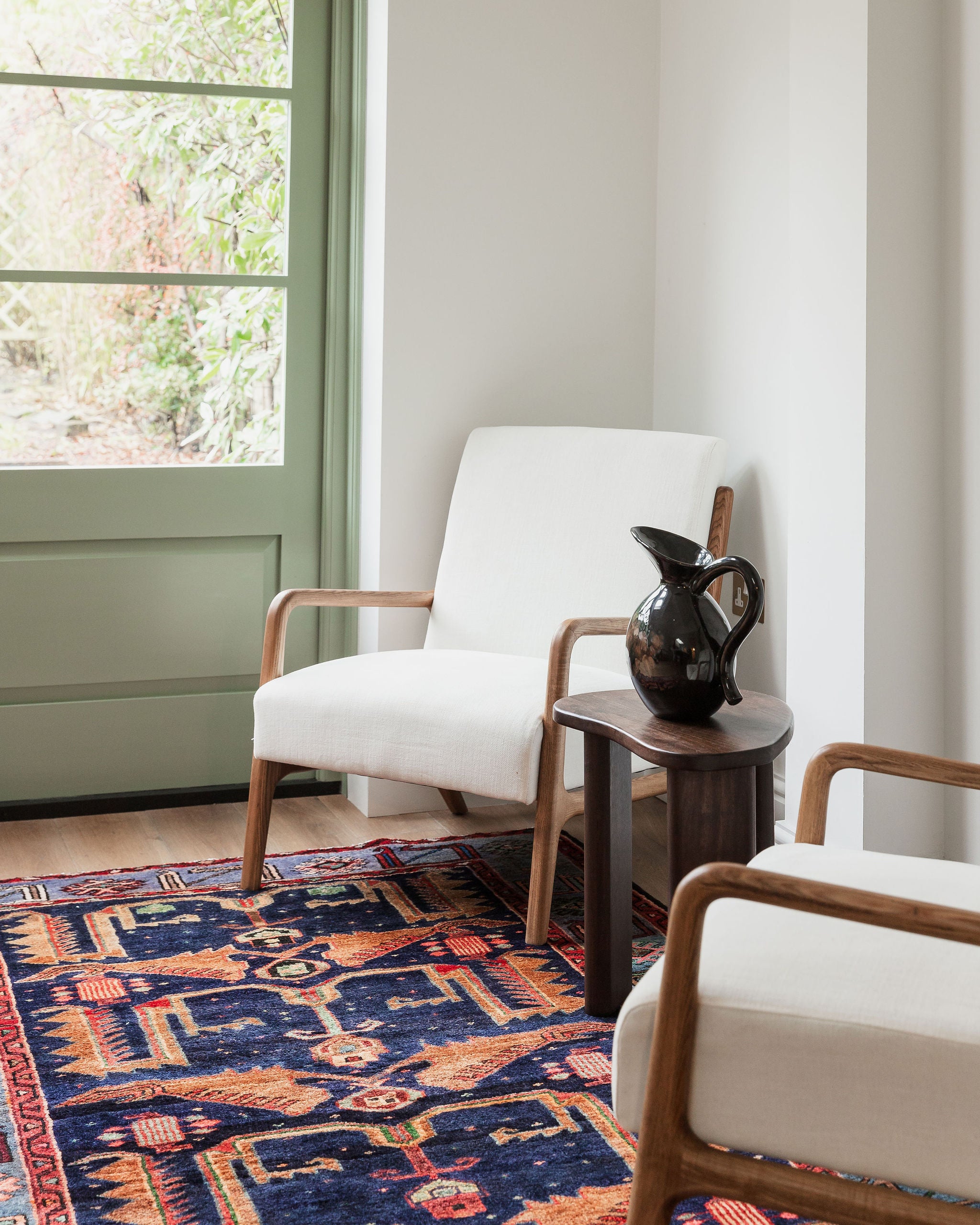
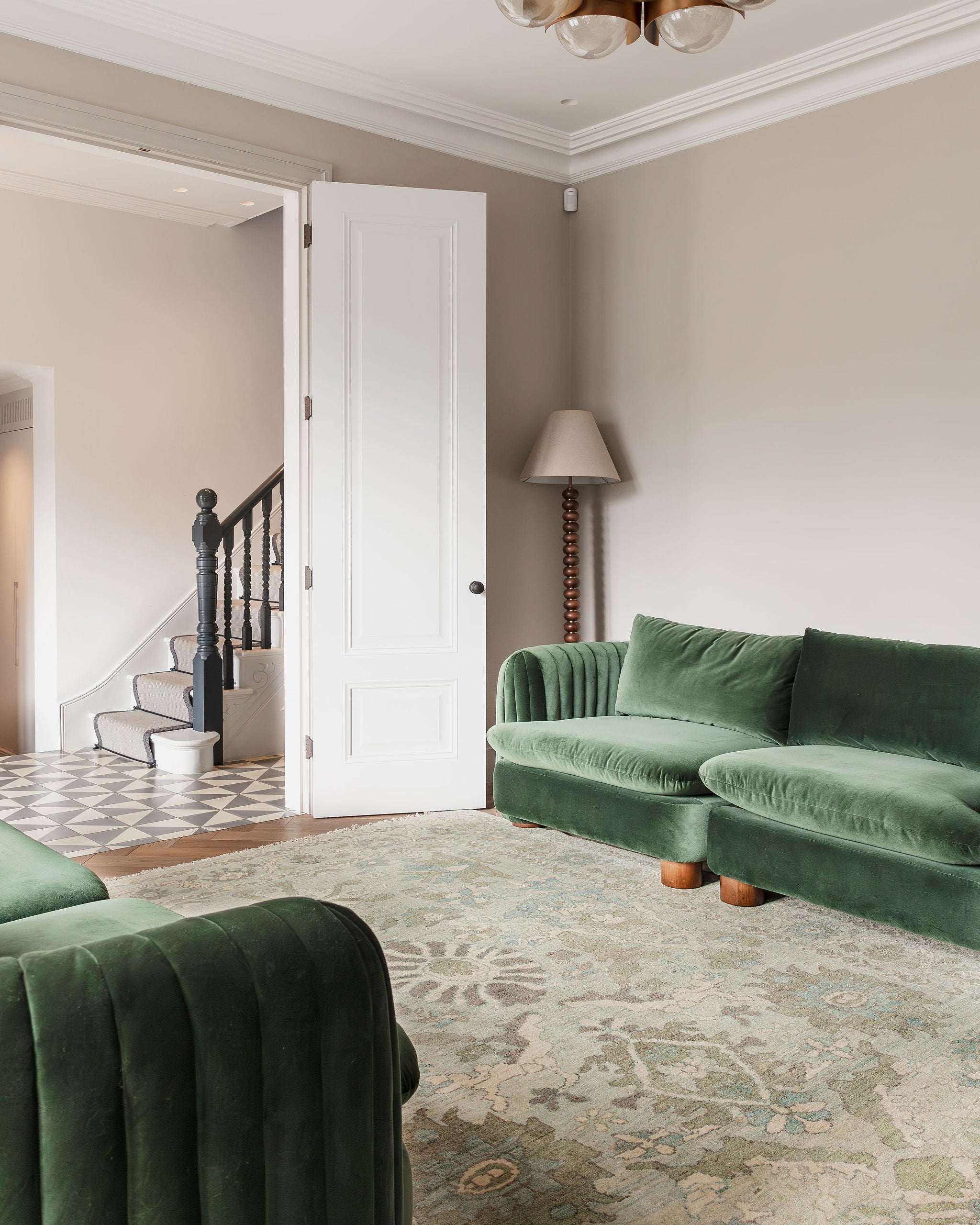
At Lilla Rugs we have thousands of rugs; you're sure to find one to suit your style and needs. Here are some of our favourite rugs to reflect the Pantone Autumn/Winter colour trend:

Rug Choices (top to bottom) - ZETTA, VIOLET, VALE, GINGER, MELBOURNE, PEBBLES
Did you like our post on Pantone colour trends Fall/Winter 2019/2020? Don’t forget to follow us on Pinterest and Instagram.
