Colour Psychology in Interior Design

Wikipedia - " the study of hues as a determinant of human behaviour”
Did you know that colour can have a huge impact on how you feel and act? Today is 'Blue Monday' so it seemed appropriate for this week's new blog post.
Colours are used to represent different emotions and moods. They are widely known to affect the human psyche as well as how we perceive spaces, objects and the way we think. It might seem strange, but it is true: the colour in your surroundings will have significant psychological effects.
Colour psychology is a powerful interior design tool; the colour and design in our home should reflect the people who live inside. Use colours wisely to create the intended atmosphere in each space. In a visual world full of Pinterest and Instagram, it’s a way to find a piece of clarity and direction instead of lusting over other peoples pads.
Most of our reactions to colour are personal. However, there are some ‘typical’ responses which might be worth noting before you start planning to redecorate. Darker colours will make a room feel smaller and more intimate, whereas lighter colours will make a room feel airy and roomy. Whether you’re looking to add occasional bursts of colour or to decorate your entire room, discover the emotional effects of the rainbow in some of our round-up colour groups. Paired with a beautiful selection of Persian rugs, it’s such a powerful way to help you pull colour schemes together confidently and with ease.
WARM COLOURS

Image Credit - Amara and Cut Y Paste
Want to create an environment of stimulation or wet people’s appetite? Warmer colours like reds, pinks and oranges are daring and dramatic whilst stimulating energy, creativity and appetite; hence being a popular choice for kitchens and dining areas where you engage in most of the entertaining. They are the perfect colours to make a room feel radiant and cosy.
Albeit, painting a room top to bottom in one of these colours could become over-stimulating, too intense, and perhaps evoke feelings of anger. We suggest using bold and bright touches of these variants around your room; a striking feature wall, stylish textiles or an eye-catching Persian or Oriental rug.
Red is certainly the ‘hottest’ and most dramatic of the colours; stimulating and invigorating, it emotes feelings of energy, strength, power, passion, desire and determination. A productive choice for home offices and creative spaces. On the other hand, red can also shorten tempers, increase irritability and induce feelings of war and danger. Therefore, perhaps it's wise to use this colour in moderation.
Red is not only powerful in its most basic form but also boasts many beautiful sister shades; crimson, burgundy and pink. All of these hues are enticing accent colours to make a ‘cool’ room look warmer. So, whether you want to channel a rich, traditional aesthetic or a pop-art feel, red can offer a solution.
Many people immediately associate the colour pink with all things feminine and girly. However, it can be linked to the masculine as well. The colour pink represents compassion, nurturing and unconditional love. It is the passion and power of red softened with the innocence, openness and completeness of white. Some shades of pale pink are described as relaxing, while very bright, vibrant shades can be stimulating or even aggravating.
Orange is a somewhat polarising colour, and people either love or hate it. It reminds us of sunshine and the tropics. It represents enthusiasm, fascination, happiness, creativity, determination, attraction, success, encouragement, and stimulation. And just like it’s warm neighbour ‘Red’, orange stimulates appetite and is a great kitchen and exercise room colour. Apricot and terra cotta orange, have been increasingly popular recently for their relaxing effect. Bright orange adds warmth and adventure but can be overpowering if used excessively.

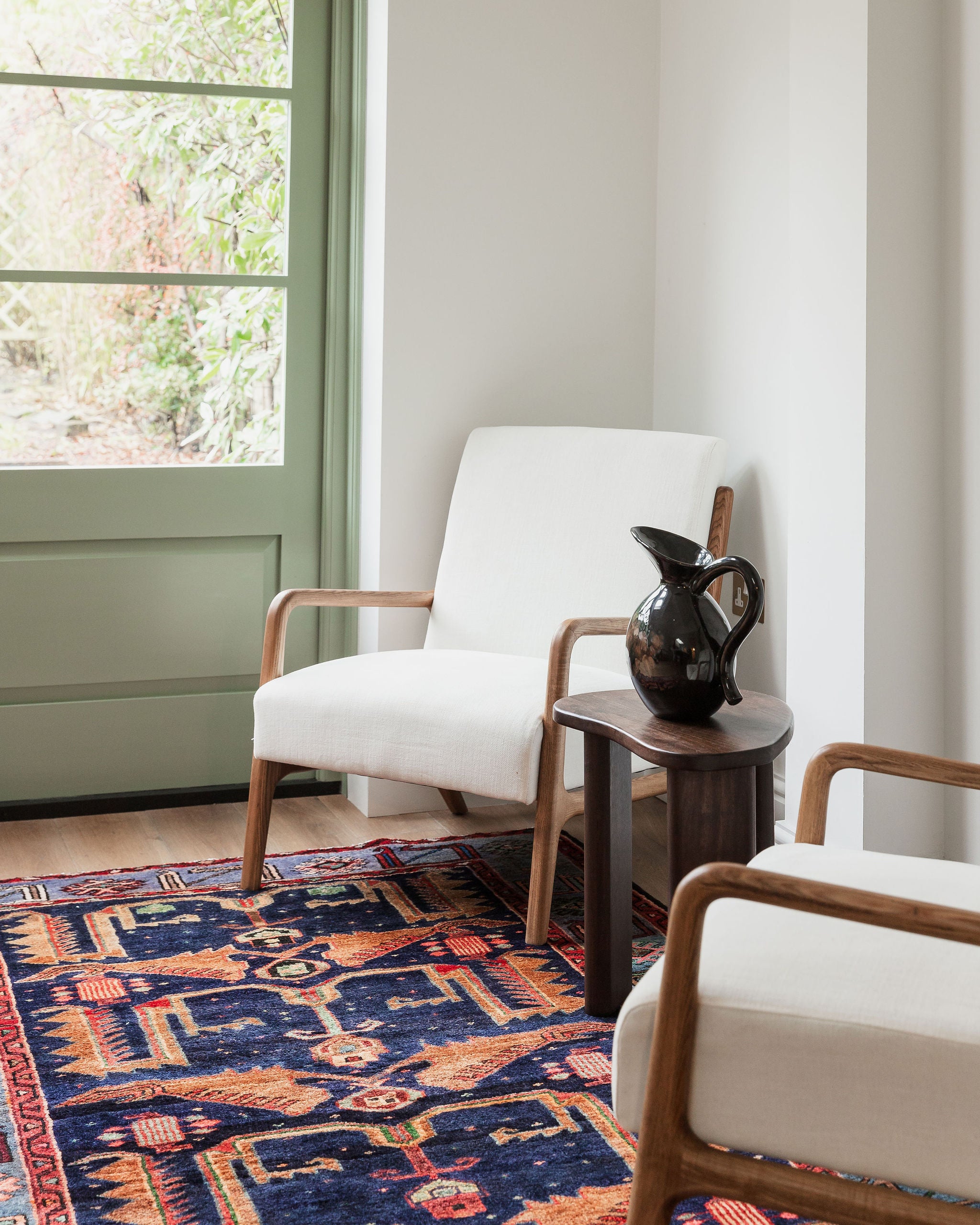
Rug Choices (left to right) - ELECTRA, MADA, PRYCE
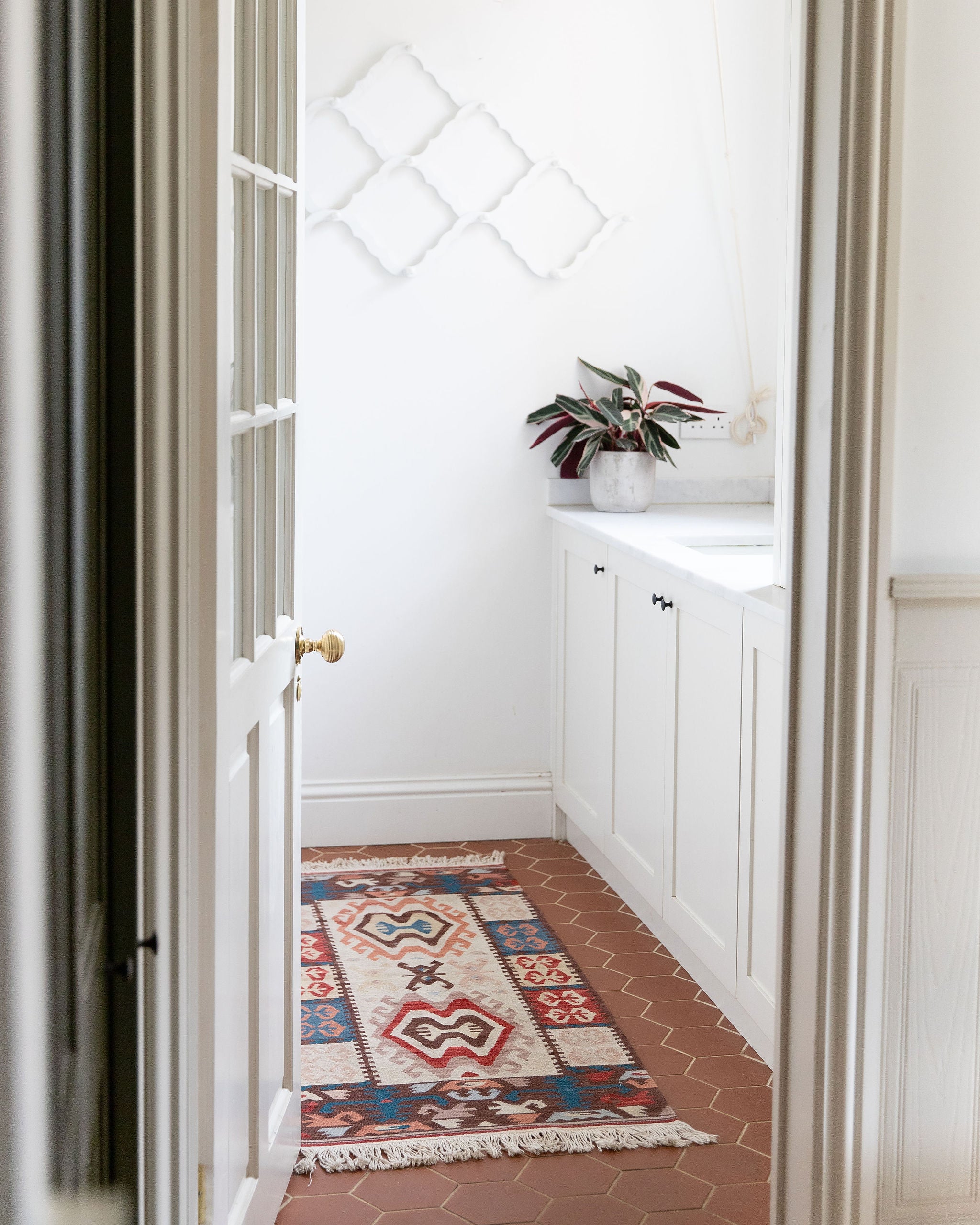
COOL COLOURS

Image Credit - Topps Tiles and Camille Styles
Cool colours like blues, greens, and purples create the illusion of space and can have a calming and relaxing effect, making them the ideal choice for bedrooms, workrooms and particularly bathrooms (as it’s reminiscent of the sea). Pairing cooler colours up with deeper accents like warm hardwood flooring works beautifully well, and if you want your home to be more connected to the outside world, try and mimic the natural make-up of the great outdoors by adding large indoor plants.
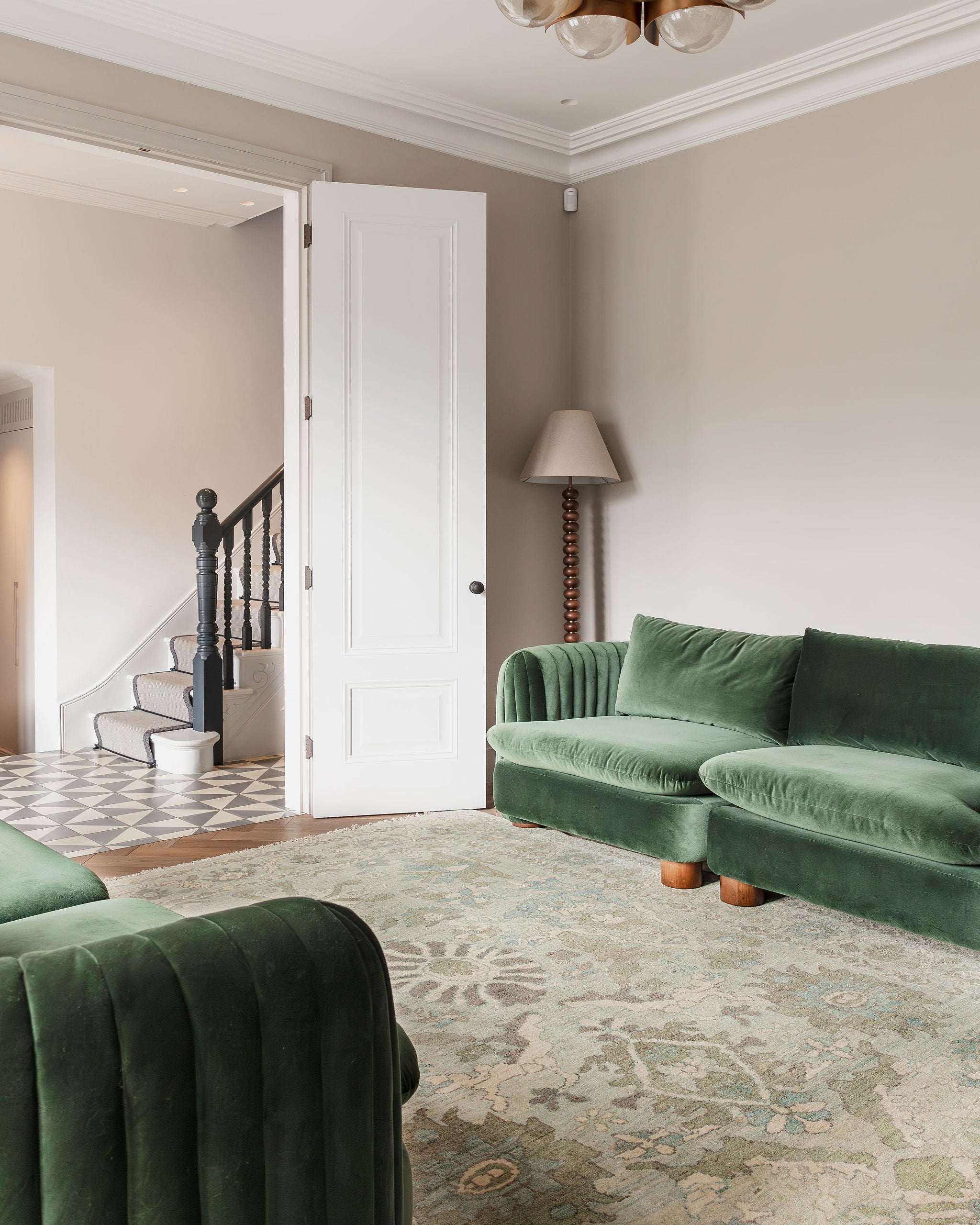
Richer variants, on the other hand, can be overpowering as a primary colour in a room and can induce inaction and sadness. Using these colours for accent pieces like a wonderful emerald green Persian rug, or a navy blue throw over your bed are an enchanting combination.
Blue is, without a doubt, the most popular colour in the UK and one of the strongest hues of the colour psychology spectrum. In fact it’s this year’s colour of the year: Classic Blue! The colour blue has many connotations and aspects; associated with trust, loyalty, wisdom, confidence, intelligence, faith, truth, and heaven. Blue slows down the metabolism and has a calming effect, so it is considered to be beneficial to the mind and body when used in the home.
Light or pastel shades of blue instil a feeling of calm and tranquility at home which makes them great for bedrooms, bathrooms and living spaces where you want to relax.
Deep, midnight blues, like navy and royal blue, are great for evoking confidence and are connected with admirable qualities such as loyalty, trust, peace and success. These blues create a feeling of luxury when used in the home. You can incorporate blue into your home in many different ways; from your walls, to accents and bold accessories like a rug.
Green is the colour of nature. It immediately brings the natural world to mind and has a remarkable way of bringing a refreshing sense of nature indoors, especially if your home is located in a city.
Considered the most restful colour for the eye, green symbolises growth, harmony, freshness, and fertility, and generally makes people feel emotionally safe. Green is an extremely positive hue, you can decorate an entire room with greens and have contrast, drama, richness, and balance. It’s so versatile. It makes an ideal wall colour in spaces where you need to open your mind such as kitchens and home studies.
Purple is associated with a wealth of wonderful emotions from depth and creativity to fantasy and nobility in colour psychology. It carries a regal charm and also suggests luxury, which enables the tone to bring real presence to a space.
Purple, in its darkest values, is dramatic, rich, and sophisticated. Lighter values of purple, such as lavender, can add a restful quality to a bedroom. It looks right at home in feminine spaces, but deeper versions of the hue can also be incredibly masculine as well.
Interior designers use purple to add drama, create a hip vibe by combining purple, pastels, and some beautiful modern art; add a bold statement with neon purple, or give a room a mysterious feel with dark purple as an accent. Think about using it in a dressing room to create a truly special getting-ready destination or let it take over your entrance hallway to impress guests at the first opportunity.

Rug Choices (left to right) - MIDNIGHT, TYDE, SKY
NEUTRAL COLOURS

Image Credit - Snaidero and Hutchinson House
Don’t be afraid to use neutrals, they will never go out of fashion! In fact, neutral colours tend to simply fade into the background and do not have a strong psychological impact on a person. This is why they are essentials in a designer’s toolkit, not only can they be used to accent any other colour chosen as a primary, but they make versatile primary choices of their own as well.
Described as the colour of perfection; white is colour psychology at it’s most pure. This muted tone is a symbol of clarity, integrity and innocence.
White signifies new beginnings and a blank canvas to write upon. It opens the way for creation; allowing you to add flair into a space, complete with stylish wall hangings and works of art. Designers often use the colour to make rooms seem larger and more spacious, as it creates a sense of space and adds highlights to the room.
White contains an equal balance of all the colours in the spectrum, representing both the positive and negative aspects of all colours. This phenomenon makes it ideal to use in areas which have many different purposes or where simplicity is needed.
Black is the go-to colour in all aspects of life; it’s a colour that stands out and attracts the eye. A proven accent colour but when used heavily in a room scheme, the psychology of this colour results in power, drama and mystery.
Although black is technically a neutral colour, it will have different emotional and psychological effects. Often associated with serious and negative connotations, like death, it can also create a mood of elegance and refinement.
Black has excelled in modern and industrial settings; it’s a timeless colour which offers a contemporary appeal to even traditional spaces. Black’s neutrality gives it a fail-safe quality and promises sleek sophistication. So put a spell on your room, what’s to love most about the dark shade?
Grey is one of those versatile colours that can take on a range of personalities. The shade in colour psychology is thought to influence perceptions of security, intelligence and solidity. It can be soft and delicate or strong and confident, it’s also said to stir a feeling of calm and composure.
Just like it’s neighbour colour black, it can have certain negative connotations. However, as with any colour, the results depend largely on how you make use of the hue. Grey is superb for creating a bold, theatrical and sophisticated effect inside your home. Matte block grey, dominants a room and acts as a sharp contrast against the white ceiling, pairing this block colour with a beautifully textured sofa and a fabulous rug displays this hue in a softer focus.

Rug Choices (left to right) - LILLY, EVA, SELENA
Whether we realise it or not, colours affect us and we respond to them. Before redecorating consider how you want the room to make you feel. It’s important to understand that in colour psychology, intuition and personal judgements play a major role. You’ll know from experience, what emotional effects the colours have on you, if a potential arrangement of colours in your home appeals to you, give it a try.
Colour can have a powerful impact on our psychology, but since there’s no exact science of colour psychology, following your own feelings is necessary.
In the meantime, if you want to learn more about colour psychology, check out - A beginners guide to Colour Psychology is the brain-child of colour psychologist Angela Wright, a recommended read if you’re interested in understanding more about the psychological effects behind colour.
The Colour White
-
purity
-
innocence
-
cleanliness
-
sense of space
-
neutrality
-
mourning (in some cultures/societies)
The Colour Black
-
authority
-
power
-
strength
-
evil
-
intelligence
-
thinning / slimming
-
death or mourning
The Colour Gray
-
neutral
-
timeless
-
practical
The Colour Red
-
love
-
romance
-
gentle
-
warmth
-
comfort
-
energy
-
excitement
-
intensity
-
life
-
blood
The Colour Orange
-
happy
-
energetic
-
excitement
-
enthusiasm
-
warmth
-
wealth prosperity
-
sophistication
-
change
-
stimulation
The Colour Yellow
-
happiness
-
laughter
-
cheery
-
warmth
-
optimism
-
hunger
-
intensity
-
frustration
-
anger
-
attention-getting
The Colour Green
-
natural
-
cool
-
growth
-
money
-
health
-
envy
-
tranquility
-
harmony
-
calmness
-
fertility
The Colour Blue
-
calmness
-
serenity
-
cold
-
uncaring
-
wisdom
-
loyalty
-
truth
-
focused
-
un-appetizing
The Colour Purple
-
royalty
-
wealth
-
sophistication
-
wisdom
-
exotic
-
spiritual
-
prosperity
-
respect
-
mystery
The Colour Brown
-
reliability
-
stability
-
friendship
-
sadness
-
warmth
-
comfort
-
security
-
natural
-
organic
-
mourning (in some cultures/societies)
The Colour Pink
-
romance
-
love
-
gentle
-
calming
-
agitation